Warm Lighting With Good Color Rendering for Wood, Linen, and Ceramics
A wooden cabinet can look rich beside the window, then strangely flat after sunset. Undyed linen may turn gray, while two ceramic glazes that were distinct in daylight seem almost identical under a table lamp. The practical answer is to choose warm light with documented color-rendering information, then judge it in the room with the actual materials you care about.
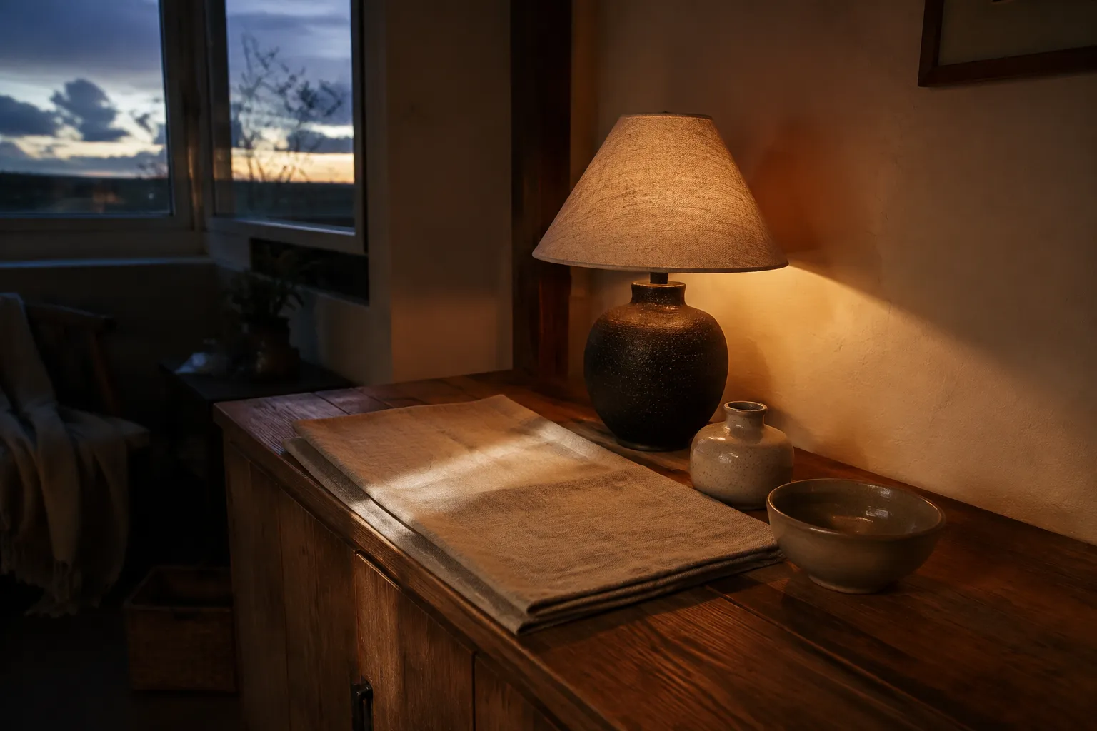
Good warm lighting color rendering depends on two separate qualities: the apparent warmth of the light and the way the lamp shifts object colors. A warm color temperature does not guarantee convincing wood, linen, or glaze color. Use the specification to narrow the choice, then make the final comparison at home, after dark and during the transition from daylight.
broader context
Broader context
Use the broader page when you need more context before this narrower page.
Warm Color and Color Rendering Are Different
Correlated color temperature, usually shown as CCT, describes the apparent color of white light along a warm-to-cool scale. Color rendering describes how object colors appear under a source compared with a reference illuminant. They affect the same room experience, but one does not establish the other.
A lamp may produce an inviting warm-white atmosphere while shifting some hues more than expected. Another lamp with a similar apparent warmth may separate the tones in timber grain, woven threads, or a variegated glaze more convincingly. The label “warm white” therefore answers only part of the buying question.
CRI, commonly expressed as Ra, is a widely used measure of average color fidelity. Its limits matter in a room: one averaged value cannot show which hues shift, whether colors appear more or less saturated, or how a particular group of objects will look. The IES TM-30 method uses complementary measures, including fidelity and gamut, because color rendition has more than one visible dimension.
You do not need to master every chart before buying a bulb. When fuller information is available in the manufacturer’s technical documentation, use it to compare candidates; when it is absent, give more weight to a returnable sample and a real-room check.
Check the Materials Separately
Wood, linen, and ceramics do not present color in the same way. Grain, weave, glaze, sheen, and surrounding reflections all change what the eye can inspect. Use one candidate lamp at a time, keep its position consistent, and look at a small group of familiar objects rather than an entire furnished room.
Wood
Inspect separation as well as warmth. Look across pale and dark grain, knots, end grain, and stained or oiled areas. Ask whether neighboring brown, red, yellow, or gray notes remain distinguishable. Warm light may make the setting feel more amber, but that broad cast is not the same as preserving variation within the timber. A glossy finish may return a bright reflection; a matte finish will show more through diffuse color and shadow.
Linen
Check hue and weave. Compare folded and unfolded areas, since a fold creates a useful change in light and shadow. Look at an undyed or muted textile beside a colored one. The question is not whether the fabric appears dramatic, but whether its base color stays recognizable and the weave remains readable without harsh glare. A lamp can render color reasonably while still lighting the cloth too evenly or from an awkward angle.
Ceramics
Compare glaze distinctions. Place a matte piece beside a glossy one, or compare two related colors. Observe the body color, painted decoration, pooling in the glaze, and darker areas around a foot or carved detail. A strong reflected highlight can conceal glaze color even when the source performs well on a rendering metric. In that case, changing the lamp position may help more than changing its color temperature.
These are observational checks, not a standardized test. They answer the narrower question that matters in a lived-in room: can you still recognize the materials and the differences that made you choose them?
Test the Lamp in the Room
A useful comparison needs stable conditions. Install candidate lamps in the same luminaire, place the same objects beneath them, and avoid changing several room lights at once. Direct switching makes small color shifts easier to notice. Phone photographs can record the arrangement, but automatic white balance and exposure may alter the result; decide by looking at the objects themselves.
Run the comparison in three conditions:
- After dark: This isolates the electric light and shows its strongest effect on wood tone, linen color, and ceramic glaze.
- With mixed daylight: Repeat the check when window light and the lamp are both present. Daylight changes across the day, so note whether the corner develops an obvious mismatch or uneven cast.
- At the level normally used: If the lamp is dimmable, inspect it at the settings you actually expect to use. Do not assume that its full-output appearance will remain identical at every setting.
Dimming deserves a practical check because the lamp, dimmer, and luminaire operate as a system. There is no general rule here for every product. Check the official compatibility documentation for the particular components, and watch for visible instability, a changed appearance, or a usable range that is narrower than expected. Questions involving wiring, wattage, heat, enclosed fixtures, or damp locations also require product-specific authoritative guidance; a color-rendering label cannot settle them.
Lamp placement is another variable that specifications cannot resolve. A bare point source may create distracting reflections on glazed ceramics. A shade or reflected source can reduce direct glare, but it also changes shadow depth and the visibility of linen weave or carved wood. Make one adjustment at a time: source, position, shade, or output.
Read the Specification as a Starting Point
When comparing warm light for natural materials, begin with products that publish more than a poetic color name. Look for a stated CCT and color-rendering information in official technical documentation. If TM-30 information is supplied, its fidelity and gamut measures offer a broader description than CRI alone; color-vector information can show that shifts are not necessarily uniform across all hues.
More data still do not create a universal “correct” lamp. Studies of color preference examine several dimensions, including fidelity, gamut, saturation, vividness, and naturalness. Their results depend on the illuminated scene and experimental conditions. Preference is not interchangeable with fidelity: a source can make some colors appear more vivid without matching a reference more closely.
This distinction explains many disappointing purchases. “Warm,” “high color rendering,” “natural,” and “vivid” describe different ideas, even when sales language places them together. A headline CRI value can narrow the field, but it cannot promise that a muted celadon glaze, reddish timber, and flax-colored cloth will all look as expected in one room.
The available literature supports the distinction between color temperature, average fidelity, gamut, and hue-specific shifts. It does not establish a universal household specification for this exact combination of materials, nor does it provide curated product tests or firsthand room comparisons. Unsupported numerical cutoffs and brand recommendations would therefore give false precision.
A Compact Buying Check
Before keeping a lamp, confirm these points:
- The manufacturer documents both apparent color temperature and color-rendering performance.
- Wood grain retains useful distinctions instead of becoming one broad brown or amber field.
- Linen’s base color remains recognizable, while folds and weave are visible without distracting glare.
- Related ceramic glazes remain distinguishable in body color, pooled areas, decoration, and shadow.
- The result still works after dark, with nearby daylight, and at the output levels you normally use.
- Lamp, dimmer, and luminaire compatibility is confirmed through the relevant official documentation.
- Placement does not put a hard reflection across the surfaces you most want to see.
The smallest reliable decision is not to search for warmth in isolation. Choose a documented candidate, place familiar wood, linen, and ceramics beneath it, and compare what remains visible. Keep the lamp that preserves the distinctions you value in the room’s ordinary evening light.