How to Choose Warm Lighting for a Calm Home
If you are searching for warm lighting for home, the room probably has one of two problems: the light feels too stark, or the “cozy” bulb you bought made everything dim and yellow. Warm lighting is not one switch, one bulb, or one exact Kelvin number. It comes from light appearance, brightness, glare control, shade material, fixture position, wall color, surface reflection, and whether the bulb works properly with the lamp or dimmer you already own.
The aim is not to make every room dark. A calm home still needs enough light for reading, cooking, cleaning, dressing, walking through hallways, and seeing objects clearly. The better question is: where should the light feel warm, where should it stay bright, and where should it be shielded?
broader context
Parent topic
Use the broader page when you need more context before this narrower page.
Warm white light meaning: what the label can and cannot tell you
“Warm white light” usually describes how the light appears: more golden or soft than cool, bluish-white light. On many bulb packages, this appears as light appearance or as a Kelvin value. Lower Kelvin numbers are generally described as warmer; higher numbers are generally described as cooler. In everyday home shopping, 2700K and 3000K lighting are commonly treated as warm or warm-white ranges.
That does not mean every 2700K bulb will look the same. A 2700K bulb behind a linen shade can look muted and gentle. The same bulb exposed in a bare ceiling fixture can still feel sharp because the bright source is visible to your eyes.
This is where many buying mistakes begin:
“Warm white”
It may mean golden or soft-looking light. Check light appearance and Kelvin value.
“Soft room lighting”
It may mean lower glare, diffused light, and layered lamps. Check shade material, bulb exposure, and placement.
“Not too dim”
It may mean enough brightness for the task. Check lumens, not watts.
“Not too yellow”
It may mean warm but still clean-looking color. Check Kelvin, shade color, wall color, and color rendering.
“Cozy but usable”
It may mean atmosphere plus practical visibility. Check ambient, task, and accent layers.
The Lighting Facts information on bulb packaging is useful because it points shoppers toward brightness and light appearance instead of relying only on front-of-box words or room photos. Marketing words such as cozy, soft, golden, or relaxing can describe a desired feeling, but they are not precise enough by themselves.
A better buying order
- Choose the room use first.
- Check brightness in lumens.
- Check light appearance or Kelvin value.
- Confirm dimmable marking if you plan to dim the bulb.
- Check fixture limits, enclosed-fixture suitability, and safety markings.
- Judge the shade and fixture, not only the bulb.
Warm lighting is not the same as low brightness
A common mistake is to make a room “calm” by simply lowering every bulb. That may look atmospheric in a photo, but it often fails in daily use. A bedroom still needs enough light to find clothing. A kitchen needs clear task light for food preparation and cleaning. A hallway or stair area should not be so dim that movement feels uncertain.
For brightness, the more useful number is lumens, not watts. Lumens describe how much light a bulb provides; watts describe power use. Older habits came from choosing incandescent bulbs by wattage, but LED bulbs can produce similar brightness with different watt numbers.
So if a warm LED looks too weak, the answer may not be “warm light is bad.” It may be the wrong lumen level, poor placement, or too much light being absorbed by the shade.
For lumens for soft room lighting, avoid searching for one universal number. Separate the room into zones instead:
- Ambient light: general light that lets you move around the room.
- Task light: focused light for reading, cooking, writing, grooming, sewing, or cleaning.
- Accent light: lower-level light for shelves, ceramics, art, plants, or textured walls.
- Path light: low but clear light for entries, stairs, hallways, and night routes.
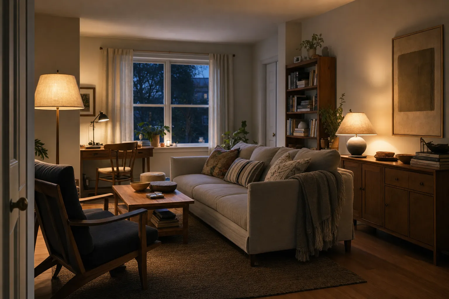
Warm lighting usually works better when brightness is placed where it is needed instead of coming from one exposed overhead bulb. A small living room, for example, may feel more settled with a shaded floor lamp near seating, a table lamp on the opposite side, and a modest ceiling fixture used mainly for cleaning. The room can stay warm without becoming visually flat.
2700K vs 3000K lighting: how to decide
The difference between 2700K vs 3000K lighting is often subtle but noticeable. In many homes, 2700K reads more golden and traditional, especially in lamps, bedrooms, and evening seating areas. 3000K often feels a little cleaner while still staying on the warm side. Neither is automatically better.
Use the room’s job as the guide:
- Choose 2700K when you want a warmer lamp glow in living rooms, bedrooms, dining corners, and evening seating areas.
- Choose 3000K when you want warmth with clearer visibility, often in kitchens, bathrooms, work corners, wardrobes, and utility areas.
- Be careful when mixing nearby bulbs with visibly different color appearances; the room can start to look patchy.
- If a fixture has multiple bulbs, keep them consistent unless the fixture is designed for adjustable light.
The question “soft white vs warm white” is less exact because retail terms are not always used consistently. “Soft white” and “warm white” may overlap on packaging. If the package gives a Kelvin value and a lumen number, those are more useful than the name alone.
Color rendering also matters. If you want warm lighting with good color rendering for wood, linen, ceramics, food, or artwork, look for the color rendering information provided by the product. Better color rendering can help materials look more natural, though the final effect still depends on room surfaces and shade material. A warm bulb with poor rendering may make timber, fabric, or glaze look dull or muddy.
There is one more reason to test before buying a full set: surrounding colors change how light is perceived. Research on warm and cool white light in colored interior environments suggests that wall color and light appearance interact, and that preference depends partly on the color environment. That study should not be stretched into a universal home rule. For home use, the practical lesson is simple: try the bulb against your actual walls, floors, textiles, and furniture before deciding it is “too yellow” or “not warm enough.”
Why a warm bulb can still feel harsh
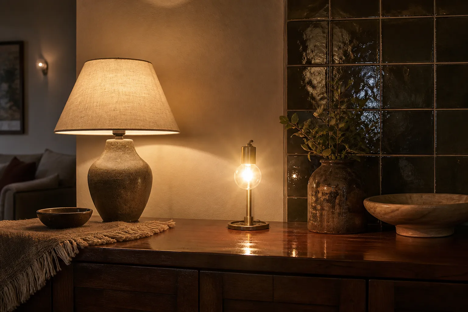
Many rooms do not feel harsh because the bulb is too cool. They feel harsh because the light source is too exposed, too high, too direct, or reflected from a hard surface.
Warm light can still feel sharp when:
- the bare bulb is visible at eye level;
- a clear glass shade exposes the LED source;
- a pendant hangs too high and throws glare across the room;
- a ceiling fixture is the only light source;
- the bulb is too bright for a small shade;
- glossy counters, white tiles, mirrors, or polished tables bounce light toward the eyes;
- the lamp is placed directly beside a screen;
- the shade is too thin, too white, or open at the wrong angle.
This is why soft room lighting is not only about Kelvin. It is often about shielding, direction, and contrast.
A fabric shade softens light differently from a metal shade. A linen shade may diffuse light through the sides while allowing stronger light above or below. A ceramic or metal shade may block side glare but create a more focused cone downward. Frosted glass can reduce the visibility of the bulb, while clear glass may keep sparkle but reveal the bright source. None of these choices is universally right; each changes the room in a different way.
For table lamps, sit where you normally sit. If you can see the bright bulb under the shade from the sofa or bed, the lamp may feel sharp even with a warm white bulb. For pendants, consider both the surface below and the eye line across the room. A dining pendant can feel pleasant when it pools light on the table, but uncomfortable if the bulb is visible from seated positions.
Ceiling fixtures need the same kind of judgment. A single central fixture can be useful for cleaning or general visibility, but it often makes a room feel flat when used alone. If the room allows it, use the ceiling light as one layer rather than the whole lighting plan.
Room-by-room choices: warmth with enough function
Warm lighting becomes easier when each room has a clear job.
Warm lighting for bedrooms without making the room too dark
For warm lighting for bedrooms, start with bedside use. Reading, dressing, and moving around the room need different light. A warm bedside lamp can be shaded and gentle, but a wardrobe or mirror area may need clearer task light. If all bedroom lighting is very low, the room may look restful in the evening but become frustrating in the morning.
A useful bedroom plan often includes:
- a warm shaded lamp on each side where possible;
- a separate light for clothing or storage;
- a ceiling or wall light that is not the only evening source;
- switches that are easy to reach from the door and bed;
- enough pathway visibility without bright exposed glare.
Warm kitchen lighting that still works for cooking and cleaning
Warm kitchen lighting needs balance. Too warm and too dim can make counters hard to inspect. Too cool and exposed can make the kitchen feel more severe than the rest of the home. Many people prefer warm or slightly warm light in kitchens, but task areas still need direct, usable brightness.
Plan kitchen lighting by surface. Counters need light on the work plane, not behind your head. If a pendant is decorative but leaves shadows where you chop or clean, add task lighting rather than increasing the whole room’s brightness.
In kitchens with wood, stone, ceramic tile, or linen shades nearby, color rendering and surface reflection matter. Glossy white tile can make even warm light feel brighter and harder. Dark matte surfaces may absorb light and require more lumens.
Warm lighting for living rooms and small spaces
For warm lighting for a small living room, avoid relying on one bright overhead source. Small rooms often feel softer with several modest lights placed low and to the side. A floor lamp near a chair, a table lamp near a shelf, and a small accent light on a textured wall can make the room feel more layered because the eye has several gentle points of interest.
Wall color changes the result. Yellow, cream, terracotta, and warm beige walls can make a very warm bulb look even more golden. Cool gray or blue walls may make the same bulb look more balanced. This is the problem behind warm lighting without yellow walls: the wall color, shade color, floor tone, and furniture all shift the final impression.
Warm lighting for home office corners
For a warm home office or writing corner, do not rely on atmosphere alone. Screens, paper, and detailed work need controlled brightness. A warm ambient lamp can make the room more pleasant, while a task lamp with good placement prevents shadows across the work surface. Keep the lamp from reflecting directly on the screen, and avoid placing a bare bulb in your forward line of sight.
Can LED bulbs make warm soft room lighting?
Yes, LED bulbs can create warm soft room lighting, but not every LED bulb will do it well in every fixture. The bulb has to match the use.
Check these details before buying:
- Light appearance: Look for the Kelvin value or warm-white description.
- Lumens: Choose brightness for the room task, not by old watt habits.
- Dimmable marking: Only use dimming where the bulb and dimmer are compatible.
- Enclosed fixture suitability: Some LED bulbs are not intended for enclosed fixtures because heat can build up.
- Fixture rating: Do not exceed the fixture’s stated limits.
- Base type and size: Make sure the bulb physically fits and does not protrude awkwardly.
- Safety or certification markings: Look for recognized markings appropriate to your region.
- Bathroom, outdoor, or damp locations: Follow the product instructions and fixture rating.
LED lighting safety and certification resources are a useful reminder that compatibility, heat, markings, and intended-use conditions matter. For everyday readers, the practical takeaway is straightforward: do not modify fixtures for atmosphere or assume any warm LED belongs in any lamp. If the fixture is hardwired, installed in a damp area, used outdoors, or connected to uncertain wiring, product instructions and qualified electrical help matter more than the desired look.
Dimming is another common source of disappointment. Dimmable warm lighting can help a room shift from cleaning to evening use, but only if the bulb and dimmer work together. Incompatible combinations may flicker, buzz, dim unevenly, or stop before the light gets low enough. If dimming is important, check both the bulb package and the dimmer information before buying multiples.
A practical decision frame for warm lighting at home
Before replacing every bulb, walk through the room in the evening and look for the actual problem. Is the light too cool, too bright, too dim, too exposed, too uneven, or simply in the wrong place?
Use this order.
1. Name the room task
Ask what must happen in the room: reading, eating, cooking, cleaning, dressing, bathing, working, walking through, or sitting with guests. Warm lighting should support the room, not erase its function.
2. Keep warmth and brightness separate
Choose the light appearance for atmosphere, then choose lumens for visibility. A warm bulb can be bright. A cool bulb can be dim. The two qualities are separate.
3. Control glare before lowering brightness
If the room feels harsh, first look for exposed bulbs, shiny reflections, high contrast, or badly aimed fixtures. Lowering lumens may help, but shielding the light often helps more.
4. Add layers instead of forcing one fixture to do everything
A ceiling light, table lamp, floor lamp, wall light, and task lamp all create different effects. A calm room usually needs both general visibility and smaller pools of light.
5. Test against real surfaces
Warm light changes when it meets oak, walnut, white plaster, cool gray paint, linen, stone, tile, brass, or glazed ceramics. If possible, try one bulb in the actual room before buying a full set.
6. Read the label and the fixture instructions
The checkable details are on the bulb label and in the fixture guidance: lumens, light appearance, dimming, fixture suitability, and safety markings. These matter more than a room photo on the package.
Where warm lighting has limits
Warm lighting can make a room look visually softer, but it should not be treated as a guaranteed way to change health or rest outcomes. The strongest support for this topic is practical: label terms, brightness, compatibility, safety awareness, and the way light appearance interacts with room surfaces. It is not strong enough to support exact universal rules for every home, product, or person.
There is also no independent product testing or full real-room walkthrough in the available source material for this page. So the most reliable approach is not to chase one “best warm lighting for home” setup. It is to make a sequence of small, observable decisions: the right warmth, enough lumens, shielded bulbs, useful task light, compatible dimming, and surfaces that reflect light in a way you actually like.
Warm light works best when it looks quiet without making the room hard to use. If a bedroom becomes too dim, add a task layer. If a kitchen becomes too yellow, try a slightly cleaner warm white and improve counter lighting. If a living room still feels harsh, shield the bulb before blaming the Kelvin number. Calm lighting is usually built through placement and restraint, not through one perfect bulb.