Warm Lighting Decision
2700K vs 3000K Lighting for a Warm Home
For most warm home lighting decisions, 2700K is the better starting point when you want a softer, more amber room. Choose 3000K when you still want warmth but need a clearer look for counters, shelves, mirrors, white walls, stone, or mixed-use spaces.
That is the practical answer to 2700K vs 3000K lighting: neither number is automatically correct. The right choice depends on what the room needs the light to do.
Use 2700K first for low evening lamps, bedrooms, reading corners, tea tables, paper shades, woven shades, warm wood, clay, linen, rattan, and rooms meant to feel visually settled. Use 3000K first for kitchens, bathrooms, entries, work tables, display shelves, mirrors, pale stone, grey finishes, black metal, and rooms that need warmth without looking too dim or golden.
Because the available research set for this page does not include public, attributable source links, this article stays with practical room observation rather than unsupported technical claims. Treat the answer as a room test, not a universal rule.
broader context
Parent topic
Use the broader page when you need more context before this narrower page.
The Quick Difference You Can See
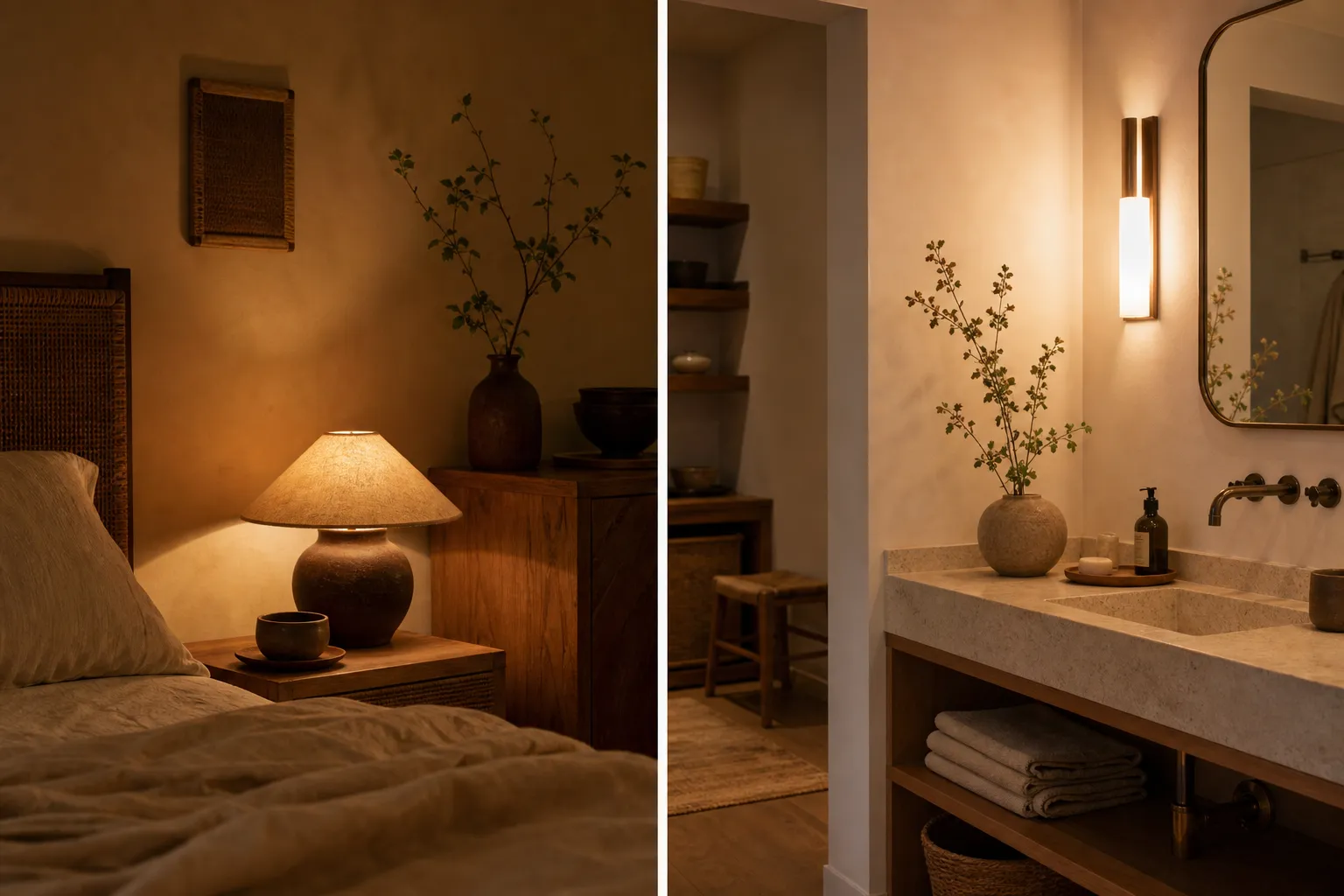
A 2700K warm white bulb usually gives a lower, softer, more amber impression. It can make wood, rattan, unglazed ceramics, warm plaster, cream fabric, handmade paper, and aged brass feel visually connected. This is the light many people mean when they ask for a soft warm room in the evening.
A 3000K warm white bulb is still warm, but it often looks a little cleaner and less golden. It can help white walls stay closer to white, keep stone or tile from looking too yellow, and give shelves, counters, and task areas more definition.
The difference looks small on a label and larger in a room. Fixture height, shade material, wall color, dimmer behavior, and bulb output can all change the result.
If the room needs
Start by testing
A softer evening glow
2700K warm white
Warmth with clearer surfaces
3000K warm white
Wood, clay, linen, paper, rattan, brass
2700K, then compare 3000K
White tile, mirrors, stone, counters, shelves
3000K, then compare 2700K
One low shaded corner lamp
2700K
Kitchen, bath, entry, or work surface
3000K is worth testing
This is a starting map, not a fixed rule.
What Changes the Answer in a Real Room
The same bulb can feel different from one room to another. Before replacing a full set, look at the surfaces and fixtures already shaping the light.
Wall color and lighting
Warm white light does not land on a blank surface. It lands on paint, plaster, tile, wood, paper, fabric, and shadow.
On creamy walls, 2700K may feel gentle and cohesive. On yellow-beige walls, it may push the room too far into amber. On cool white or grey walls, 2700K can soften the space, but it may also clash with daylight or cooler finishes. In those cases, 3000K often feels more balanced.
Dark walls add another variable. Deep green, charcoal, brown, and muted blue absorb more light, so 2700K can become intimate but visually low. That may suit a quiet corner. If the same room is used for reading, cooking, sorting, or cleaning, 3000K may keep the warmth while making surfaces easier to read.
Material appearance
A warm home is not only a color temperature. It is the way light touches the things in the room.
2700K often suits materials with warm undertones: walnut, oak, bamboo, rattan, jute, linen, unbleached cotton, clay, terracotta, warm stone, handmade paper, and brass. It can make small objects feel less isolated and help the room look more gathered.
3000K may work better when materials need clearer separation. A shelf with books, ceramics, plants, black frames, pale stone, and white walls can stay warm without everything turning golden. It may also suit stainless steel, chrome, cool tile, pale marble, grey upholstery, or black-and-white contrast.
Neither option makes materials automatically better. If one object matters to the room, test it where it normally sits and look at it in the evening.
Shade material and fixture placement
The bulb is only one part of the result.
A cream fabric shade, paper lantern, woven shade, or parchment-like diffuser can make 2700K feel especially soft. In a small corner, that may be exactly right. Across several lamps, it can become too heavy if every fixture uses the same tone.
White glass, clear globes, metal reflectors, and open fixtures make the difference between 2700K and 3000K more visible. Exposed bulbs can feel more pointed even when the color temperature is warm. A softer bulb may suit an exposed lamp, while 3000K may work better in a pendant, sconce, or task fixture where definition matters.
Placement matters too. A low table lamp can carry 2700K beautifully because the light is close, shaded, and part of the evening layer. A ceiling fixture using 2700K may feel warm but flat if it is the only source. A wall sconce at eye level may need diffusion more than it needs a different Kelvin number.
The most common problem is not choosing 2700K or 3000K. It is asking one overhead fixture to do every job. A warm room usually looks better with layers: a ceiling source if needed, a shaded lamp, a low corner light, and a focused light near a task.
A Practical Test Before Buying Multiples
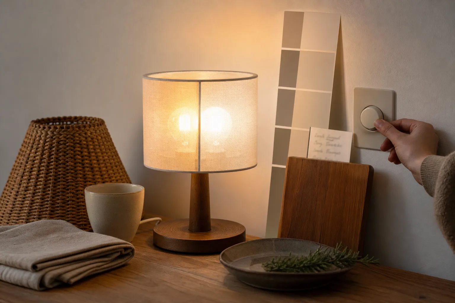
Do not decide from a store aisle or product photo. Buy one 2700K bulb and one 3000K bulb in the same general style if possible, then test them in the actual fixture.
Use this short room test:
- Test at night, after daylight is gone.
- Put the bulb in the fixture you plan to use.
- Look at walls first, then floors, then key materials.
- Sit where you normally sit.
- Check one object you care about: a ceramic cup, wood tray, textile, book cover, plant, or stone surface.
- If the fixture uses a dimmer, test the levels you actually use.
- Leave the bulb in place for one ordinary evening before deciding.
If you are choosing for several rooms, start with one representative space. A living room lamp, kitchen pendant, and bedroom sconce may not need the same answer.
Common Confusion: Both Are Sold as Warm
Many people get stuck because both 2700K and 3000K may be described as warm white. Packaging may also use words like soft, cozy, warm, or bright warm in loose ways. Those words can help you shop, but they should not replace a room test.
The difference is not dramatic like comparing a warm lamp with a cool work light. It is a smaller shift inside the warm range. That small shift still matters in a calm interior because the room depends on close relationships: the wall beside the floor, the shade above the table, the clay cup on the wood tray, the evening corner near the brighter kitchen.
Brightness can also confuse the decision. A bulb that is too bright can make 2700K feel less soft than expected. A bulb that is too dim can make 3000K seem dull even though it is slightly clearer. If the room feels wrong, the problem may be bulb output, fixture direction, shade material, or the number of light sources—not only Kelvin.
Dimming is product-specific. Some bulbs and dimmers work together more pleasantly than others, so test your actual dimmer before buying a full set.
Room-by-Room Starting Points
Living room
For a living room, start with 2700K for shaded lamps, low side tables, paper lanterns, and corners with wood or textiles. If the room has built-in shelves, art, pale walls, or darker areas that need definition, try 3000K in those specific fixtures.
Bedroom
For a bedroom, 2700K is usually the first test for bedside lamps and low evening lighting. If the room includes a dressing area, mirror, or storage zone, 3000K may work better there while the bedside light stays softer.
Kitchen
For a kitchen, 3000K is often the more practical first test because counters, food surfaces, cabinets, and cleaning areas need clearer visibility. A nearby dining nook or small sideboard lamp may still feel better at 2700K.
Bathroom
For a bathroom, 3000K may be worth testing around mirrors, tile, stone, and metal finishes. If the bathroom also has a secondary lamp or low evening fixture, that light can be warmer.
Entry, hallway, or stair landing
For an entry, hallway, or stair landing, 3000K can help objects and edges read more clearly while still feeling warm. If the area is mostly a quiet transition with paper, wood, or textile details, 2700K in a shaded wall light may be enough.
Tea corner, reading chair, or display shelf
For a tea corner, reading chair, cultural display shelf, or seasonal object arrangement, 2700K is usually the first bulb to try. The point is visual: a softer glow may suit natural materials, shadow, and small objects better than a clearer light.
When 2700K Is the Better Choice
Choose 2700K when the room should feel low, soft, and visually gathered. It is the better starting point when the light source is close, shaded, or used mainly in the evening.
It also works well when the room already has warmth in its materials. Wood floors, bamboo blinds, clay vessels, linen curtains, woven baskets, and warm plaster usually do not need a cleaner light to feel at home.
But 2700K can go too far. If white walls look yellow, books look muddy, food surfaces look dull, or a small room feels sleepy rather than simply warm, test 3000K before changing furniture, paint, or fixtures. Sometimes the room does not need less warmth; it needs clearer warmth.
When 3000K Is the Better Choice
Choose 3000K when you want a warm home that still reads cleanly. It is often a better first test for rooms where you cook, sort, clean, dress, or look closely at surfaces.
3000K can also help with cooler materials: grey stone, white tile, black metal, stainless steel, pale marble, cool white walls, and modern cabinetry. The room can still feel warm, but the materials keep their edges.
The tradeoff is that 3000K may feel too crisp in a low, quiet corner, especially with exposed bulbs or reflective shades. If the lamp is meant to make a small pool of evening light near a chair, 2700K may do that job better.
The Sensible Answer for a Warm Home
Use 2700K for low, shaded, evening lamps. Use 3000K for warm task light, overhead fixtures, kitchens, bathrooms, entries, and places where surfaces need clearer definition. Then adjust by room.
A warm home does not need one Kelvin value everywhere. Softer light can belong where you sit and pause; clearer warm light can belong where you prepare, wash, sort, or move through the space. If neighboring fixtures are visible at the same time, test them together at night so the room does not look patchy.
The final choice should be made with your walls, shade material, fixture placement, dimmer setup, and personal preference. If 2700K makes the room too amber, move toward 3000K. If 3000K feels too clear or exposed, move back toward 2700K. The best warm lighting for home is not the number that sounds coziest. It is the light that makes the room’s materials, tasks, and evening rhythm feel visually settled.