Practical seasonal home edit
How to Use Seasonal Color at Home Without Buying More Decor
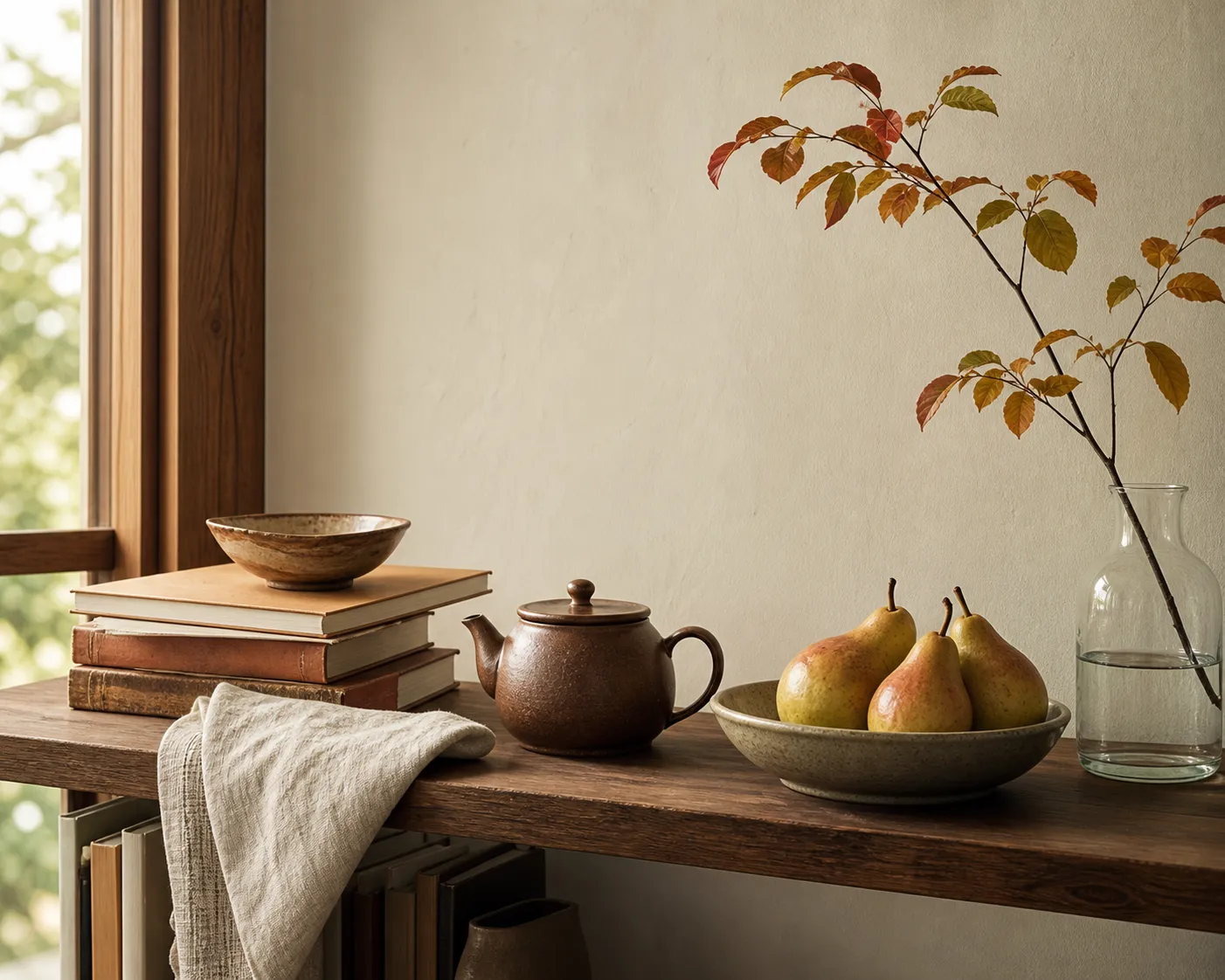
Use seasonal color without buying decor by working with what is already in the room. Choose one small color direction for the season, then repeat it in a few movable places: a folded throw, a bowl of fruit, a stack of books, a teacup, a textile, or a small branch in a vase.
The point is not to remake the room. It is to let the season show up lightly, without adding storage problems or visual noise. A room often feels more seasonal when fewer objects are visible, not when more are added.
broader context
Parent topic
Use the broader page when you need more context before this narrower page.
Start with the colors already in the room
Before choosing a seasonal color palette at home, stand in the room during the time of day you use it most. Look for the colors already carried by fixed surfaces and everyday objects:
- Wall color, flooring, wood tone, stone, tile, or large rugs
- Sofa fabric, bedding, curtains, cushions, or throws
- Tableware, tea ceramics, trays, baskets, books, and framed art
- Plant leaves, flowers, branches, fruit, and outdoor views
- Lampshades, candleholders, picture frames, and small storage boxes
This is your real palette. It matters more than a trend board because these colors are already doing most of the visual work.
A low-clutter seasonal edit usually works best when you choose one direction rather than many. Autumn does not need every shade of orange, rust, brown, gold, and deep red at once. You might pull forward warm clay, faded persimmon, and dark wood. Spring does not need to become pastel everywhere. It might be one pale green textile, white ceramics, and a few branches.
If the room already has strong color, do less. A blue sofa, red rug, green kitchen tile, or patterned bedding may already dominate the view. In that case, seasonal color can be a supporting note: a bowl of pears, a cream cloth, a darker book stack, a single flower, or a changed arrangement on one shelf.
If the room is mostly neutral, existing textiles and tableware can carry enough color when they are grouped with intention. One brown teapot beside a linen runner and two amber books will read more clearly than the same items scattered across the room.
Make one seasonal color group
The simplest method is to create a small group of objects that share a seasonal feeling. It does not need to be formal. It just needs repetition.
Choose three to five items you already own
- A throw or cushion already in storage
- A teacup, plate, bowl, or tray
- A book with a useful spine color
- A print, postcard, or small framed artwork
- A vase with flowers, branches, seed heads, or clipped greenery
- A bowl of fruit or vegetables that will actually be used
- A basket, wooden box, folded cloth, or small lamp
Place the group where the eye naturally pauses: a low table, kitchen shelf, entry surface, bedside stool, dining sideboard, or reading corner. Avoid spreading the objects across too many surfaces. Seasonal color grouping works because the eye can understand the connection quickly.
A practical rule is to make one visible cluster and one quiet echo.
Shelf example
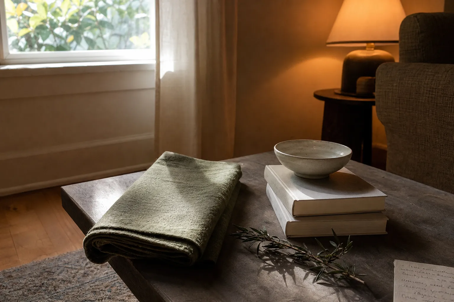
The main cluster might be a dark green book, a brown teapot, and a branch in a ceramic vase on a shelf. The quiet echo might be a green cloth folded near the dining table.
Kitchen example
The main cluster might be a white bowl of oranges, a small blue plate, and a plain linen cloth in the kitchen. The quiet echo could be a blue book on the coffee table.
This keeps the room from feeling themed. It also prevents the common problem of adding “seasonal” items to every corner until the home feels busy.
Use textiles, tableware, books, and art first
To decorate with what you have, look first at objects that can move without disrupting the room’s function.
Textiles
Textiles are usually the easiest place to begin. Throws and pillows already owned can shift the color temperature of a sofa, chair, or bed. A darker throw can make a room feel more settled in cold months. A lighter cloth can reduce the visual weight of a table or bench in warmer months. Keep the number small. One folded throw often looks calmer than three arranged pillows that have nowhere to go when someone sits down.
Tableware
Tableware is useful because it already belongs in daily life. A tea bowl, serving plate, small tray, or cup can become part of a seasonal surface without becoming extra decor. In a quiet corner, a single ceramic bowl may be enough. In a kitchen, a tray with cups you actually use can create color without adding a purely decorative object.
Books and artwork
Books and artwork can also be adjusted. Try turning a few books so their spines support the season’s color direction. Move one small artwork from a hallway to a shelf for a month. Lean a postcard in front of a stack of bowls. These are small edits, but they change what the room says first.
Natural objects
Natural objects are useful when they are simple and temporary. Flowers, branches, and fruit bring seasonal color without requiring long-term storage. Use what fits the surface, remove it when it declines, and avoid arrangements that block conversation, light, or table use. A few stems in a narrow vessel often serve the room better than a large display.
Check the light before deciding
Room light changes how seasonal color reads. A color that looks gentle in morning light can feel heavy in a dim corner. A pale object can disappear against a bright wall. A dark object can look rich on a sunny shelf and flat in shadow.
Test seasonal color where it will actually sit. Put the textile, book, bowl, or branch in place for one day before deciding. Look at it in the morning, late afternoon, and evening with lamps on. If it only looks right for a short part of the day, choose another object or another location.
This helps with purchase-light seasonal styling because it stops you from solving the wrong problem. Sometimes the issue is not that you lack seasonal decor. It is that the color is sitting in the wrong light. A rust cloth may work better near wood than beside a cool white wall. A blue ceramic may feel clearer on an open shelf than on a crowded counter.
When a room feels dull, try moving color toward the place where natural light lands. When a room feels visually loud, move the stronger color lower or farther from the main sightline. These are observation-based choices, not fixed rules. The useful answer is the one that makes the room easier to live with.
Edit shelves before adding pieces
Shelf edits for seasonal color are often more effective than adding new objects. A shelf may already contain enough color, but too many shapes and categories can compete with one another.
Begin by clearing one small area: one shelf, one tray, one side table, or one kitchen ledge. Put back only the objects that support the color direction and the function of that spot. Leave more space than feels natural at first. Then add one practical item if needed: a lamp, cup, small box, or folded cloth.
A useful shelf edit has three qualities
- It repeats one or two colors already in the home.
- It leaves open space around the seasonal objects.
- It does not make daily tasks harder.
If a shelf becomes harder to dust, a table becomes harder to eat from, or a chair becomes covered in cushions, the styling is no longer serving the room. Low clutter seasonal styling should reduce friction, not create a new maintenance task.
Storage rotation can help, but it should stay simple. Instead of keeping all small objects visible all year, store a few in a box or cabinet and rotate them when the season changes. The goal is not to create a large seasonal inventory. It is to let a smaller number of familiar objects have their turn.
What changes the answer
The best way to use seasonal color depends on the room’s limits. A small apartment, a family kitchen, a quiet tea corner, and a bright dining room will not need the same approach.
If storage is limited
Use temporary color first: fruit, flowers, branches, objects borrowed from another room, or tableware already in use. Avoid adding anything that needs off-season storage unless it is useful beyond one short season.
If the room is already full
Subtract before adding. Remove two visible objects and bring in one seasonal color cue. A room rarely needs both more color and more objects at the same time.
If the room has fragile objects, pets, children, or narrow walking paths
Keep seasonal styling stable and out of the way. Avoid tall arrangements on busy tables, unstable stacks, or objects placed where they can be knocked over.
If the room serves many functions
Use soft, movable color. A folded cloth, cushion, tray, or book stack can be changed quickly when the room shifts from work to meals to rest. Fixed displays are less helpful in rooms that need to adapt throughout the day.
If cultural or traditional seasonal objects are meaningful in your home
Treat them with care and specificity. Do not borrow symbols only because they look seasonal. If you do not know the context of an object, keep the styling general: natural color, familiar materials, ordinary household items, and seasonal observation from your own surroundings.
Common confusion: seasonal does not mean more
The main misunderstanding is that seasonal color requires a new set of objects. It does not. It usually requires noticing, editing, and rotating.
Another confusion is that each season has one correct palette. Real homes are more varied. Winter can be pale, dark, warm, quiet, or bright depending on the room. Summer can be green and white, blue and wood, straw and clay, or simply lighter in visual weight. The season is not a prescription. It is a cue to look again.
There is also a difference between color and theme. Color can be subtle: cream ceramics in winter light, a red book beside a brown cup, green stems in a glass jar. A theme usually announces itself more loudly. If you want a calm room, color is usually easier to live with than theme.
Buying less does not mean doing nothing. A no-buy approach still asks for judgment. You choose what is visible, what is stored, what supports the room, and what has become clutter. That is design work, even when no money is spent.
A simple no-buy seasonal color reset
Use this short process when a room feels ready for a seasonal shift:
- Choose one surface: shelf, table, bed, entry bench, or counter.
- Remove the small objects from that surface.
- Name the colors already fixed in the room.
- Choose one seasonal color direction that works with those colors.
- Gather three to five existing objects that support it.
- Put back fewer objects than you removed.
- Check the arrangement in daylight and lamplight.
- Store or return anything that does not help the room.
This reset should take minutes, not an afternoon. If it becomes complicated, narrow the task. One shelf is enough. One textile is enough. One bowl of fruit can be enough.
The useful test is simple: does the room feel more coherent without becoming harder to use? If yes, keep the seasonal color in place. If not, remove one object, reduce the color contrast, or move the group to a quieter spot.
Seasonal color at home is less about owning the right decor and more about seeing what is already available. A room changes with light, use, weather, meals, flowers, books, cloth, and the objects that pass through daily life. When those ordinary things are edited with care, the season can be visible without another shopping list.